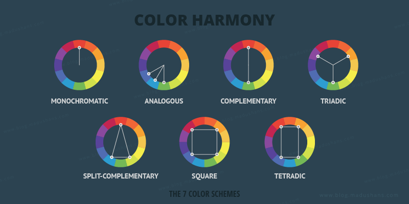
WHAT DOES COLOR HARMONY MEAN?
Color harmony is when you use color combinations side-by-side that are pleasing to the human eye. This can either create contrast or consonance (when you use similar shades)—so long as they make
sense together and create a visually satisfying effect.
MONOCHROMATIC
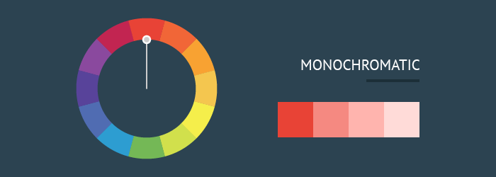
The easiest formula for harmony is monochromatic because it only uses one color or hue. To create a monochromatic color scheme, pick a spot on the color wheel, then use your knowledge of saturation and value to create variations.
ANALOGOUS
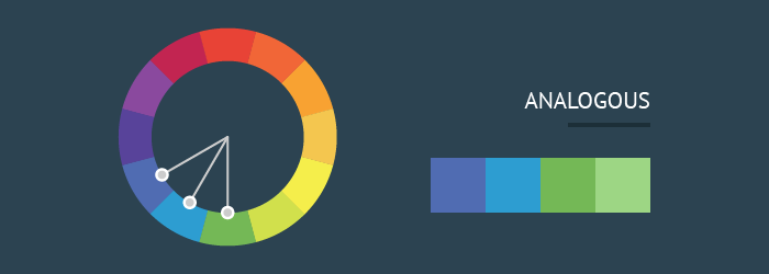
An analogous color scheme uses colors that are next to each other on the wheel, like reds and oranges or blues and greens.
COMPLEMENTARY

Complementary colors are opposite each other on the wheel; for instance, blue and orange or the classic red and green. To avoid complementary color schemes that are too simplistic, add some variety by introducing lighter, darker, or desaturated tones.
SPLIT-COMPLEMENTARY

A split-complementary color scheme uses the colors on either side of the complement. This gives you the same level of contrast as a complementary color scheme but more colors to work with (and potentially more interesting results).
TRIADIC
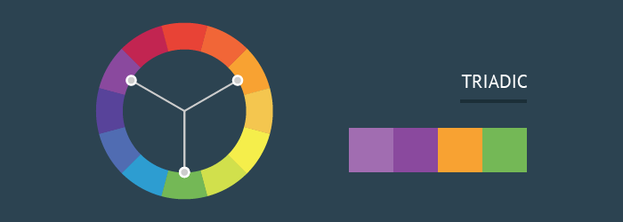
A triadic color scheme uses three colors that are evenly spaced, forming a perfect triangle on the wheel.
TETRADIC
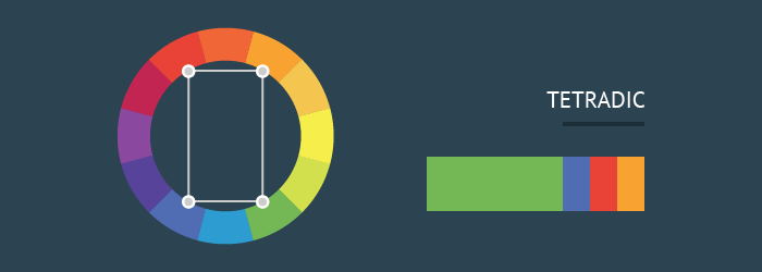
Tetradic color schemes form a rectangle on the wheel, using not one but two complementary color pairs. This formula works best if you let one color dominate while the others serve as an accent.
SQUARE
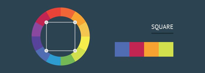
The square color scheme is similar to the rectangle, but with all four colors spaced evenly around the color circle. Square color schemes works best if you let one color be dominant. You should also pay attention to the balance between warm and cool colors in your design.